The Role of Composition in Interior Photography: Framing Spaces Like a Pro
Why Composition Matters in Interior Photography
Composition is the backbone of interior photography. It determines how a viewer’s eye travels through the image, what elements draw attention, and how the space feels overall. Even with perfect lighting and the best equipment, poor composition can make a photo feel flat and unappealing. Strong composition helps showcase the design, balance the visual weight of elements, and communicate the atmosphere of a space effectively.
Understanding the Rule of Thirds
One of the most common guidelines in photography, the rule of thirds, involves dividing your frame into nine equal sections using two horizontal and two vertical lines. Placing key elements along these lines or at their intersections creates a balanced and visually pleasing image. In interior photography, this could mean aligning furniture, architectural features, or décor along these points, ensuring the viewer’s attention is guided naturally through the space.
Leading Lines to Guide the Viewer’s Eye
Leading lines are elements within the scene that direct the viewer’s gaze toward a specific focal point. In interior spaces, these can be lines created by floors, ceilings, beams, hallways, or even furniture arrangements. By strategically incorporating these lines into your composition, you can create a sense of depth and guide the viewer’s eye to important design features.
Balancing Elements for Visual Harmony
A well-composed interior photograph needs balance, which can be symmetrical or asymmetrical. Symmetry works well in spaces designed with mirrored layouts, such as formal dining rooms or hallways. Asymmetry, on the other hand, can create a more dynamic and casual feel, often used in eclectic or modern interiors. The key is ensuring no part of the frame feels too heavy or too empty, which might distract from the overall design.
Framing Within the Frame
Framing involves using elements within the scene to create a natural border around your subject. In interior photography, this might be achieved by photographing through a doorway, placing objects in the foreground, or using architectural features to enclose the focal point. This technique adds depth and context, making the viewer feel as if they are stepping into the scene.
Using Negative Space to Emphasize Design
Negative space—the empty areas within a photo—can be a powerful compositional tool in interior photography. By allowing space around a key object or feature, you give it room to breathe and stand out. This approach can also convey a sense of minimalism, elegance, or calm, depending on the design style of the interior.
Considering Perspective and Angles
The angle and height from which you shoot can dramatically change how a space is perceived. Shooting from eye level gives a natural, realistic view, while a slightly lower angle can make furniture and décor appear more prominent. Wide-angle lenses are often used to capture the breadth of a room, but they must be used carefully to avoid distortion. Experimenting with perspectives helps you find the most flattering way to present each space.
Layering for Depth and Interest
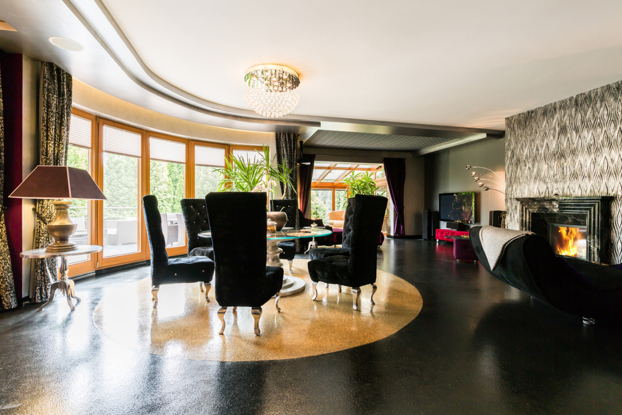
Layering involves incorporating foreground, middle ground, and background elements in your composition to add depth. This technique makes the viewer feel as though they are moving through the space rather than looking at a flat image. A chair in the foreground, a coffee table in the middle, and a window view in the background can create a rich and inviting composition.

